01
Home

02
About Studio RCW
03
Our Work
04
Services
05
Insights
06
Contact Us

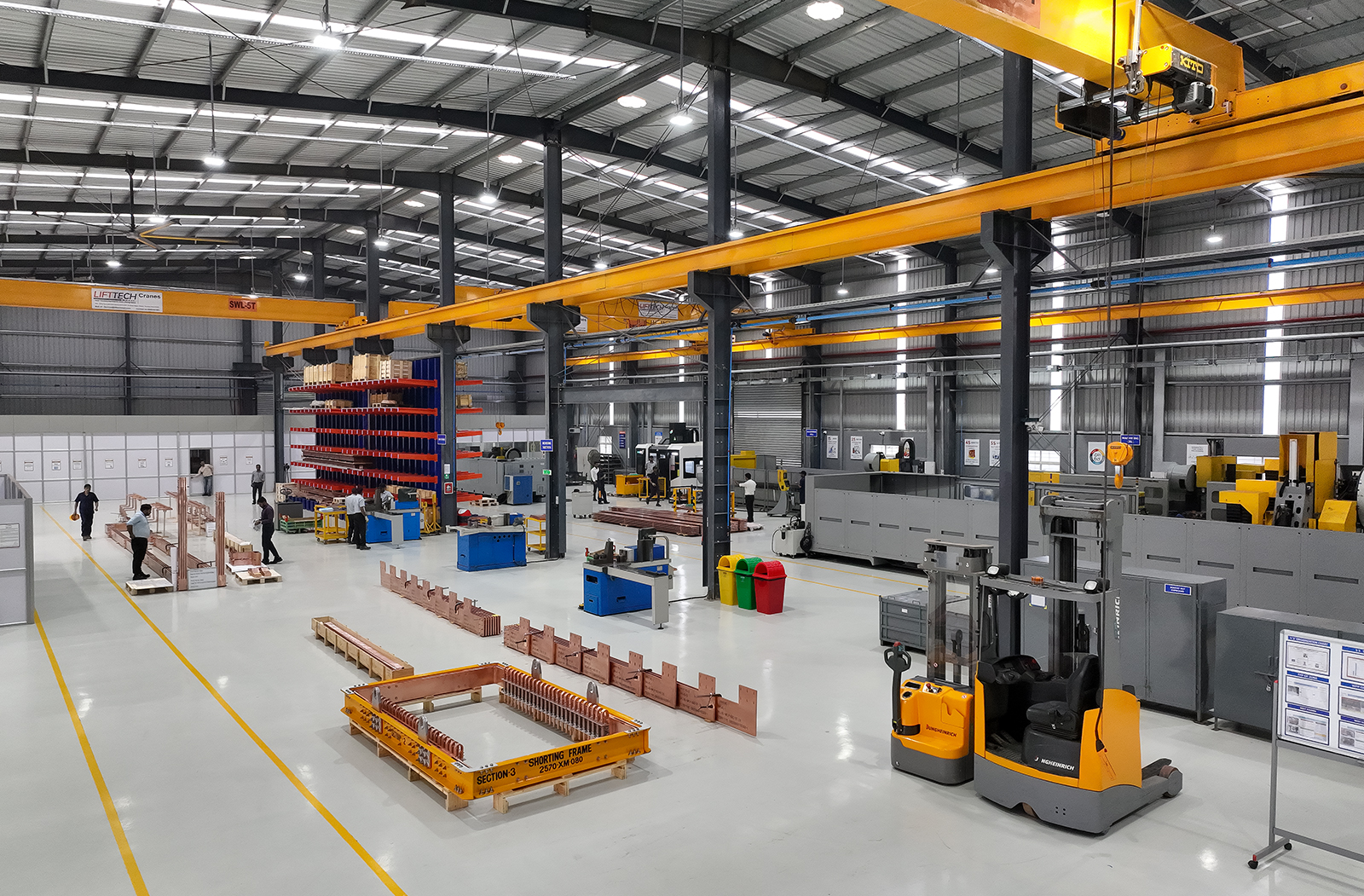
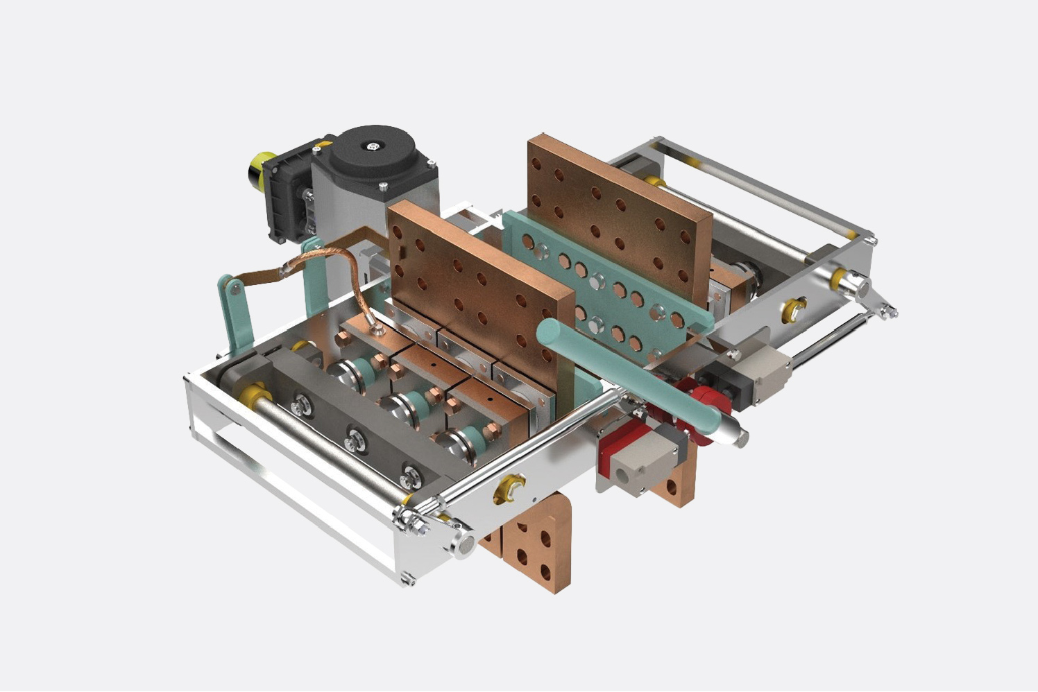
MSS is a serious player in the energy world, with more than 50 years of success delivering precision-engineered components and bespoke assemblies.
Our job? To rebrand and reposition them. To reaffirm their status as a global leader today, while also projecting their ambition for the future.
The Challenge
MSS needed a new identity to match their global positioning and reputation. Professional. Respected.
But despite it feeling a little outdated, a little lacking in conviction, they didn’t need it so new that people would fail (or even struggle) to recognise them. Retaining brand enquiry was a must
To make matters even more interesting, they own a number of brands and wanted to align them all under the same MSS umbrella.
The Solution
A full brand architecture strategy.
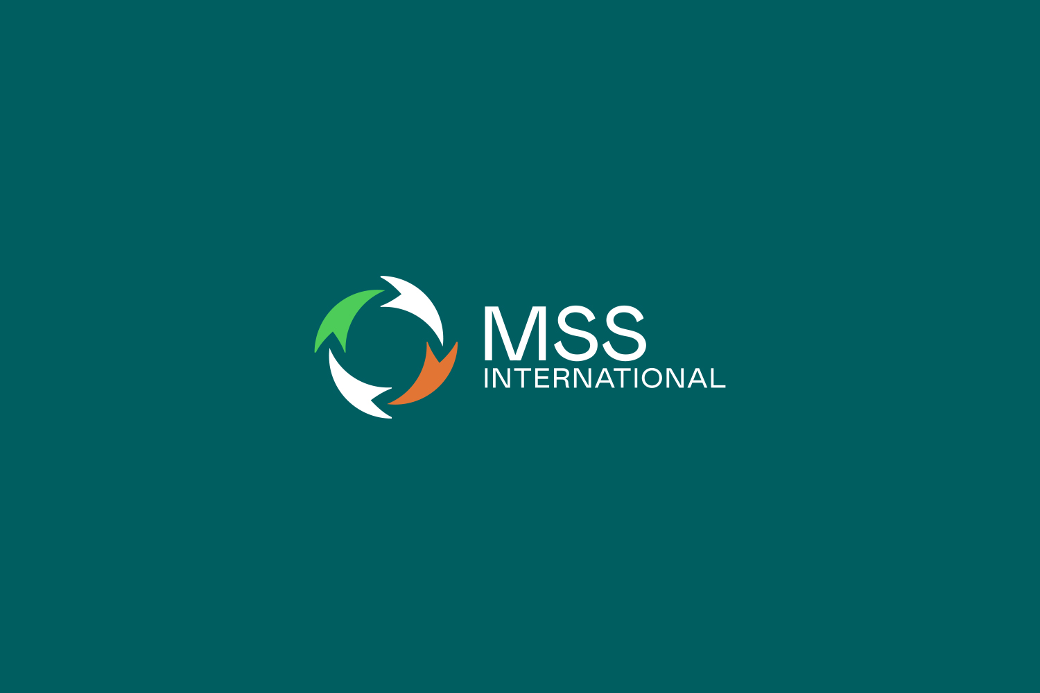
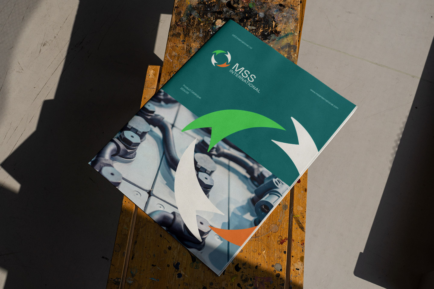
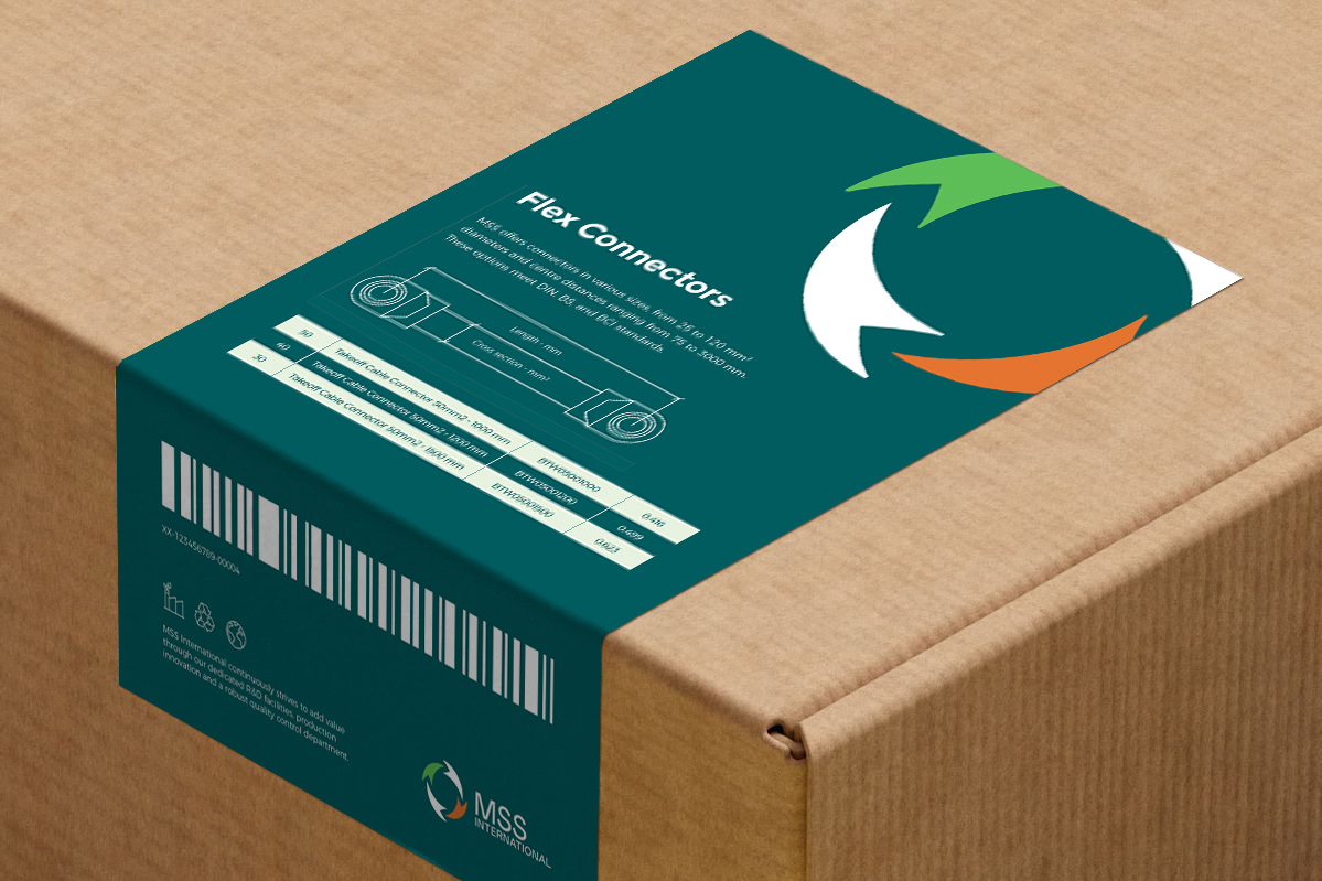
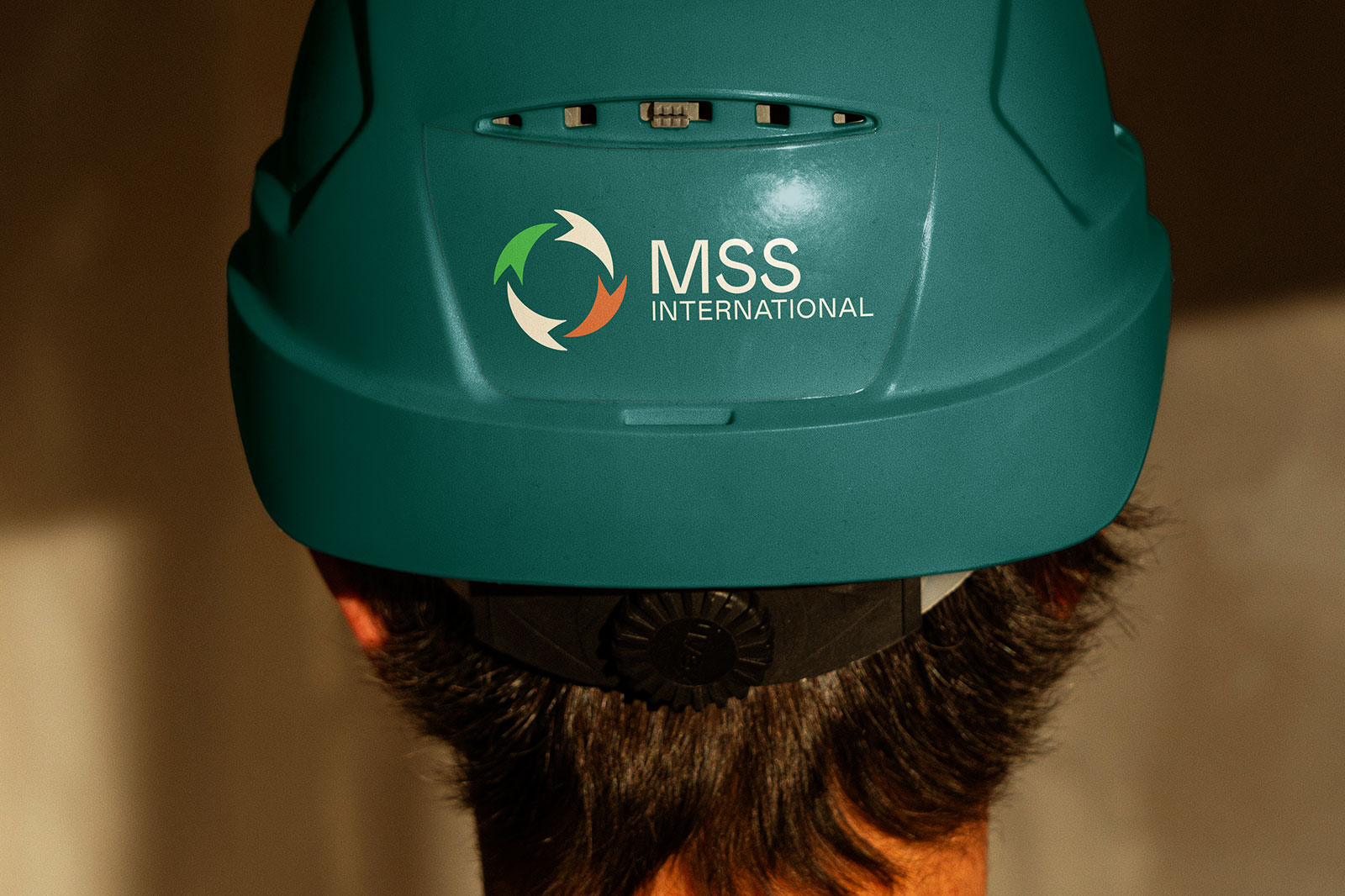
We started with a new brand identity that as well as protecting the equity in their existing brand, also reflected their commitment to sustainability.
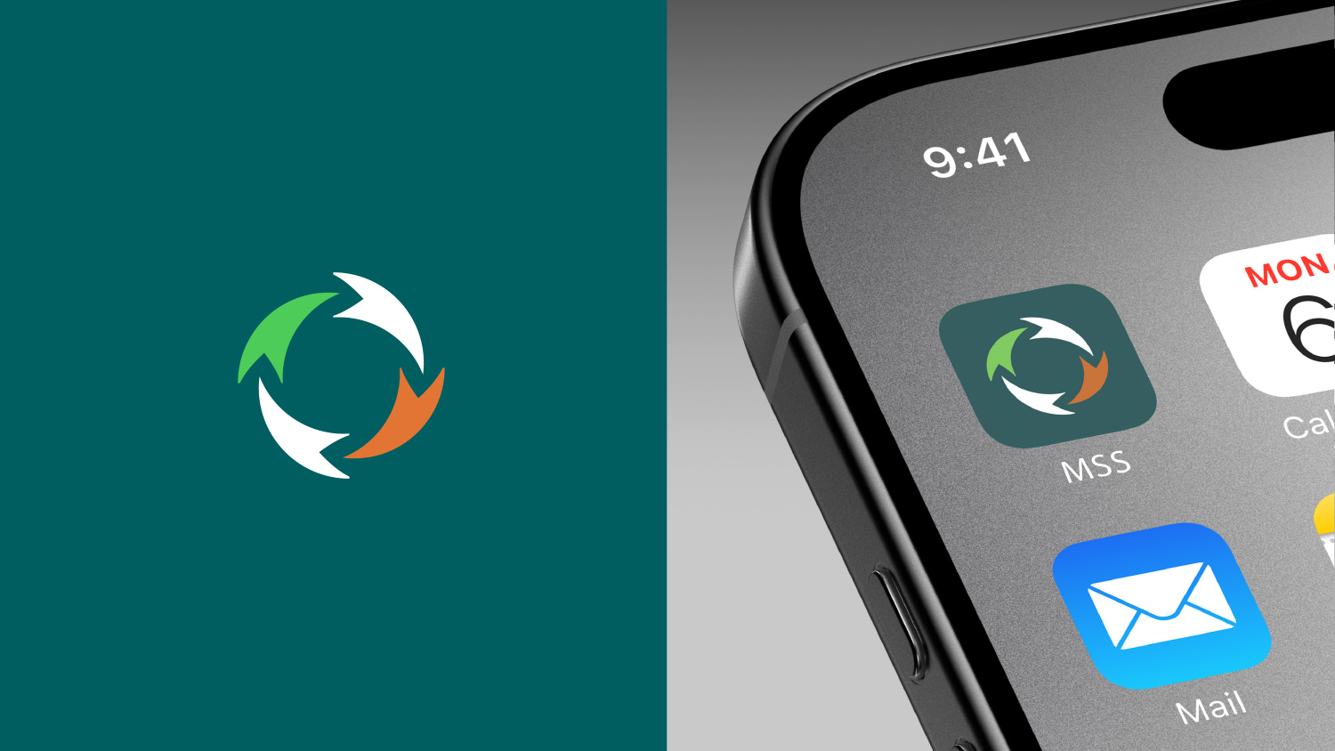
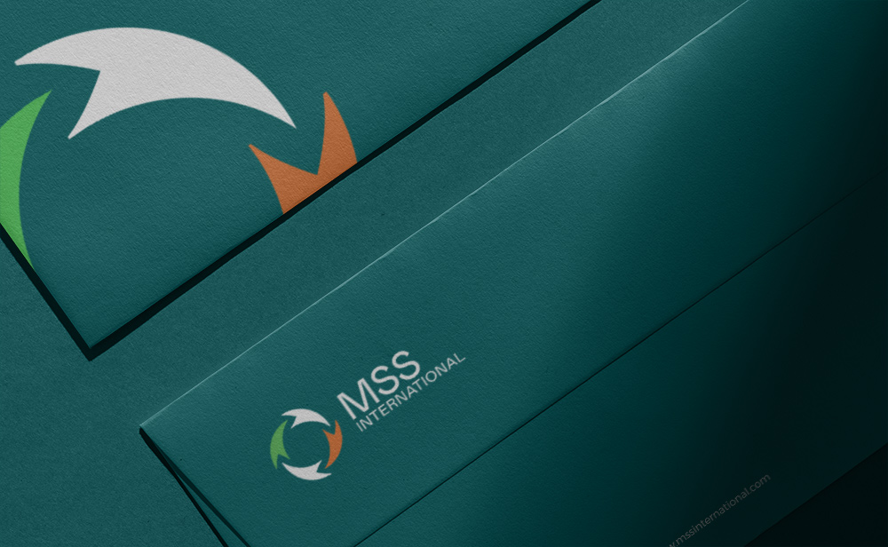
We modernised their colour palette. We redrewn their brandmark to streamline it and make it more ownable.
We revised that brand architecture, changing it from MSS Products to MSS International. And we brought their other brands G Corner and Elmecon, under the same MSS umbrella, each with an updated brand identity.
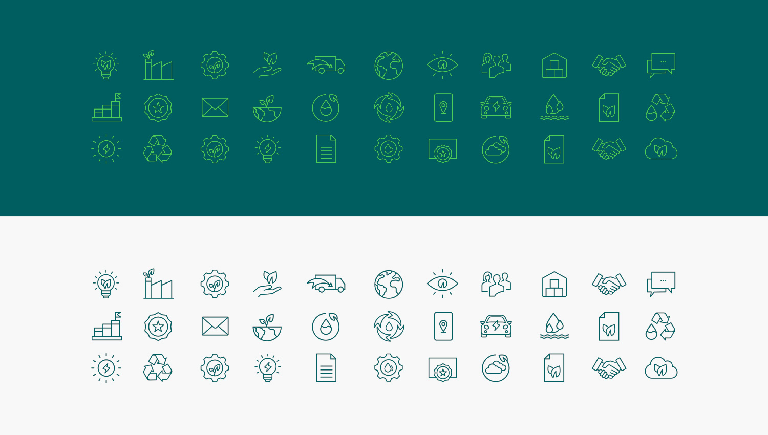
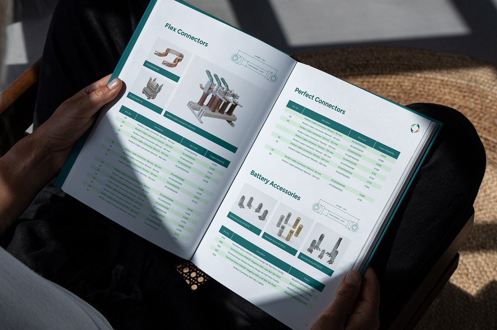
We updated guidelines, palette, imagery, iconography and visual assets.
And we gave them the confidence that whenever the question is design – we’re the answer. An extension of their team with all graphic design support they ever need.
The Result
An MSS modern/classic brand and sub-brand family. More confidence. More consistency. More brand recognition wherever in the world they sell.